Barcelona, Spain
Menu
Close
Roundten Eyewear Packaging
This project marks the launch of a comprehensive five-year visual strategy for Roundten Eyewear. The objective was to design a premium packaging ecosystem that bridges the gap between high-end product engineering and tactile brand experiences. By establishing a bold, minimalist structural language, the design translates the brand’s technological core into a commanding physical presence that stands out across international markets.
Client
Roundten Eyewear
Collaborators
Design: Marc Freixas, Raul Rodriguez; Copywriting: Maria White
Scope
Packaging Design, Art Direction, Product Design
The Totem Concept: Material Contrast
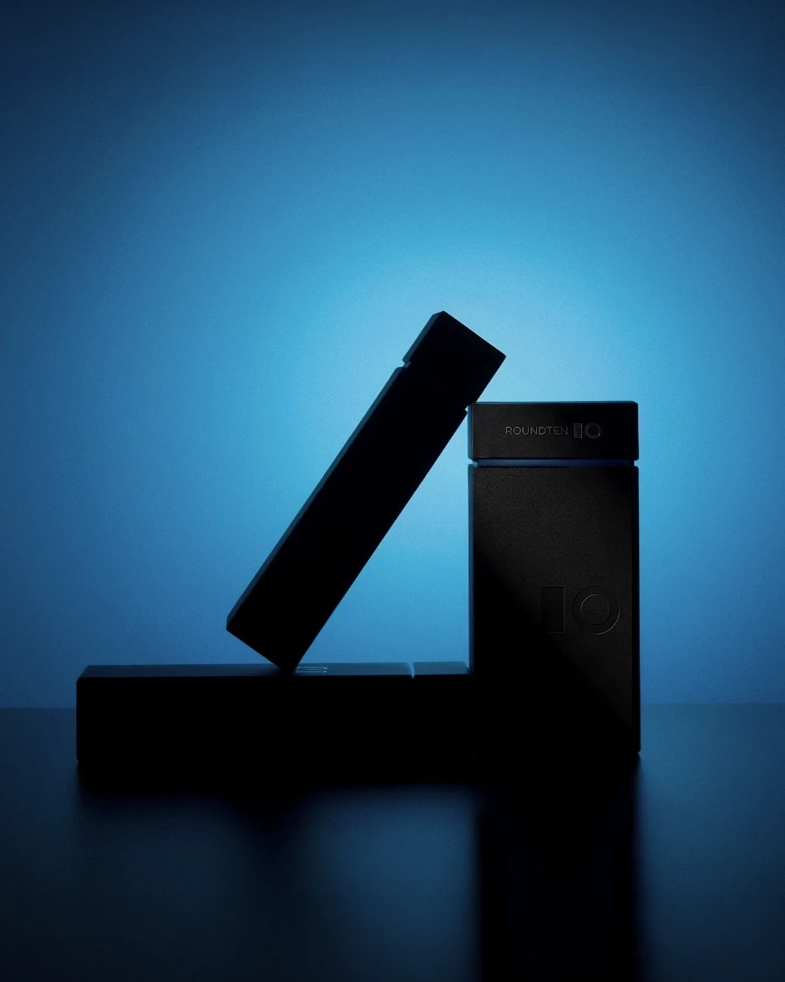
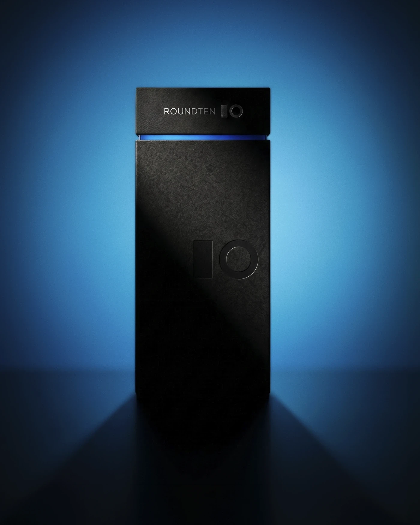
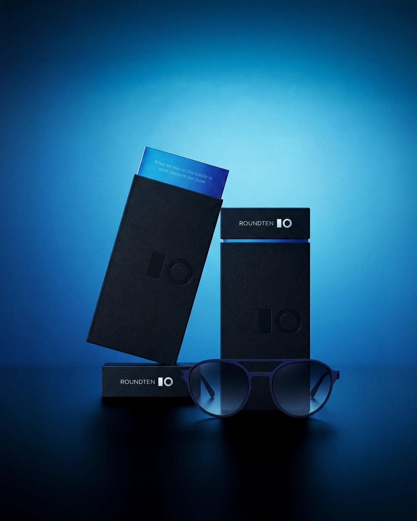
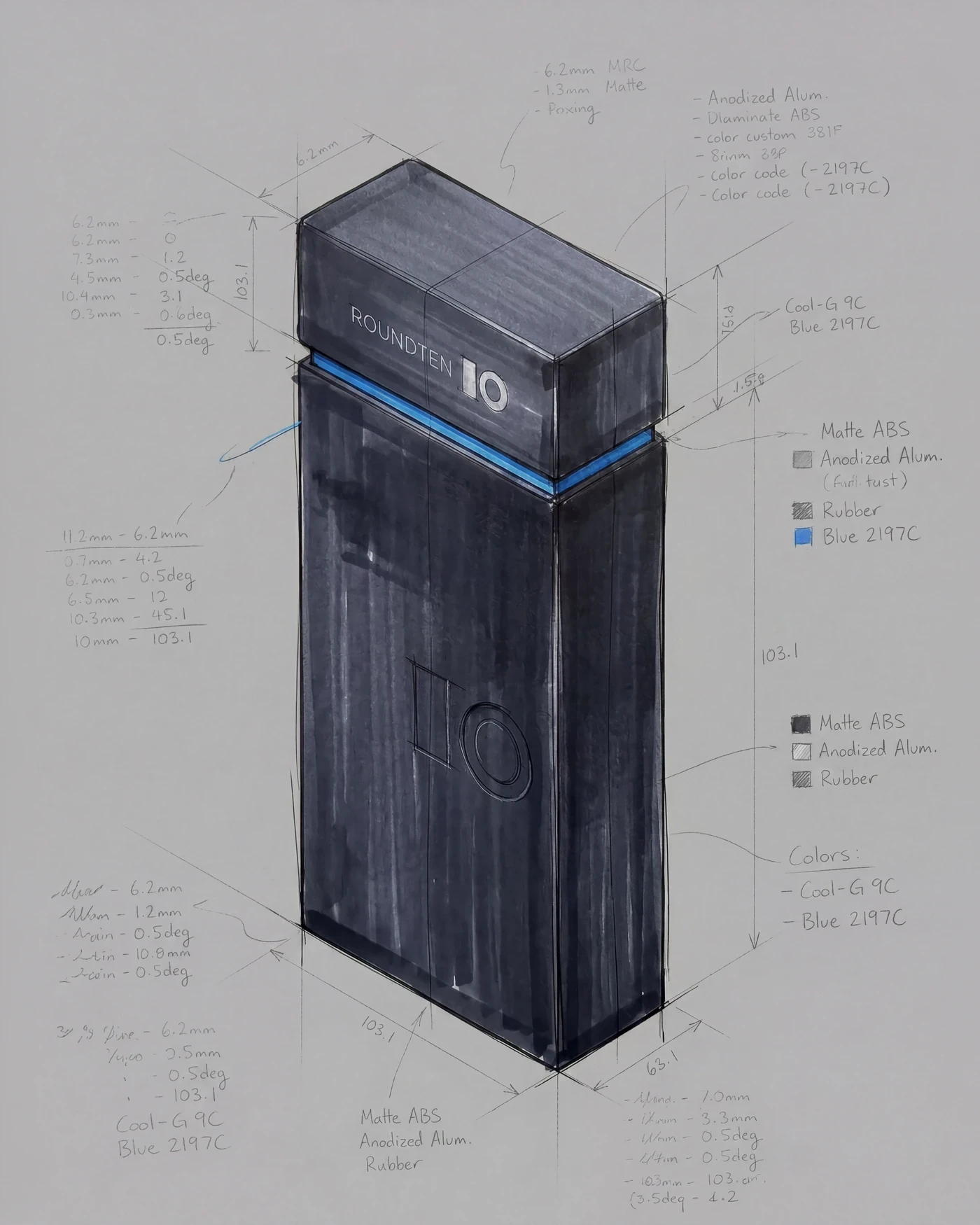
While Roundten’s eyewear is defined by extreme lightness—crafted from 0.5mm laser-cut metal without screws—the packaging was conceived as its architectural antithesis. Designed as a monolithic totem, the structure relies on rigid, straight lines and premium heavyweight cardboard. This deliberate weight creates a striking ritual when opening the box, contrasting the robust, dark presence of the outer shell with the precise, technical product resting inside.
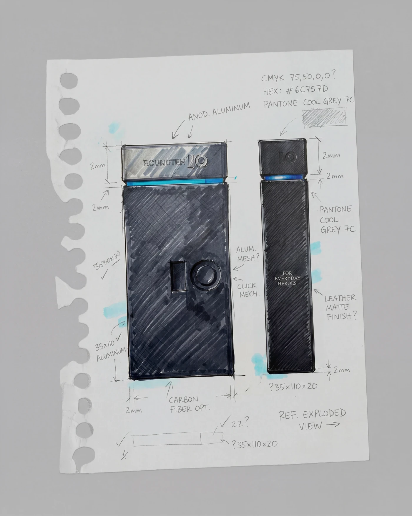
The visual identity of the pack is driven by tactical restraint. The absolute matte black finish of the paper is punctuated only by a deep blind-embossed logo, creating a subtle interplay with light. To mirror the brand’s technological core, a sharp line of electric blue hot stamping cuts horizontally through the totem, echoing the technical blueprints and exact color coding developed during the rigorous prototyping phase.
“The packaging for Roundten Eyewear was an exercise in structural tension. We wanted to transform a simple glasses case into an industrial object—a monolith that feels architectural yet tech-driven. By balancing the absolute silence of the matte black cardboard with the sharp scream of the metallic blue stamping, the packaging doesn’t just protect the product; it establishes the structural language of the brand.”
— Sebastian Saavedra




Roundten Eyewear Packaging
This project marks the launch of a comprehensive five-year visual strategy for Roundten Eyewear. The objective was to design a premium packaging ecosystem that bridges the gap between high-end product engineering and tactile brand experiences. By establishing a bold, minimalist structural language, the design translates the brand’s technological core into a commanding physical presence that stands out across international markets.
Client
Roundten Eyewear
Collaborators
Design: Marc Freixas, Raul Rodriguez; Copywriting: Maria White
Scope
Packaging Design, Art Direction, Product Design
The Totem Concept: Material Contrast
While Roundten’s eyewear is defined by extreme lightness—crafted from 0.5mm laser-cut metal without screws—the packaging was conceived as its architectural antithesis. Designed as a monolithic totem, the structure relies on rigid, straight lines and premium heavyweight cardboard. This deliberate weight creates a striking ritual when opening the box, contrasting the robust, dark presence of the outer shell with the precise, technical product resting inside.
The visual identity of the pack is driven by tactical restraint. The absolute matte black finish of the paper is punctuated only by a deep blind-embossed logo, creating a subtle interplay with light. To mirror the brand’s technological core, a sharp line of electric blue hot stamping cuts horizontally through the totem, echoing the technical blueprints and exact color coding developed during the rigorous prototyping phase.
“The packaging for Roundten Eyewear was an exercise in structural tension. We wanted to transform a simple glasses case into an industrial object—a monolith that feels architectural yet tech-driven. By balancing the absolute silence of the matte black cardboard with the sharp scream of the metallic blue stamping, the packaging doesn’t just protect the product; it establishes the structural language of the brand.”
— Sebastian Saavedra
Roundten Eyewear Packaging
This project marks the launch of a comprehensive five-year visual strategy for Roundten Eyewear. The objective was to design a premium packaging ecosystem that bridges the gap between high-end product engineering and tactile brand experiences. By establishing a bold, minimalist structural language, the design translates the brand’s technological core into a commanding physical presence that stands out across international markets.
Client
Roundten Eyewear
Collaborators
Design: Marc Freixas, Raul Rodriguez; Copywriting: Maria White
Scope
Packaging Design, Art Direction, Product Design
The Totem Concept: Material Contrast
While Roundten’s eyewear is defined by extreme lightness—crafted from 0.5mm laser-cut metal without screws—the packaging was conceived as its architectural antithesis. Designed as a monolithic totem, the structure relies on rigid, straight lines and premium heavyweight cardboard. This deliberate weight creates a striking ritual when opening the box, contrasting the robust, dark presence of the outer shell with the precise, technical product resting inside.
The visual identity of the pack is driven by tactical restraint. The absolute matte black finish of the paper is punctuated only by a deep blind-embossed logo, creating a subtle interplay with light. To mirror the brand’s technological core, a sharp line of electric blue hot stamping cuts horizontally through the totem, echoing the technical blueprints and exact color coding developed during the rigorous prototyping phase.
“The packaging for Roundten Eyewear was an exercise in structural tension. We wanted to transform a simple glasses case into an industrial object—a monolith that feels architectural yet tech-driven. By balancing the absolute silence of the matte black cardboard with the sharp scream of the metallic blue stamping, the packaging doesn’t just protect the product; it establishes the structural language of the brand.”
— Sebastian Saavedra