Barcelona, Spain
Menu
Close
Prada Parfums Concepts
Packaging proposal for Prada Parfums based on a fashion trend analysis, developed as a concept exercise for the Puig group.
Client
Prada / Puig S.A
Collaborators
Project Management: Carles Pibernat; Design: Irene Sanz
Scope
Creative Direction, Packaging, Art Direction

From trend analysis to the geode
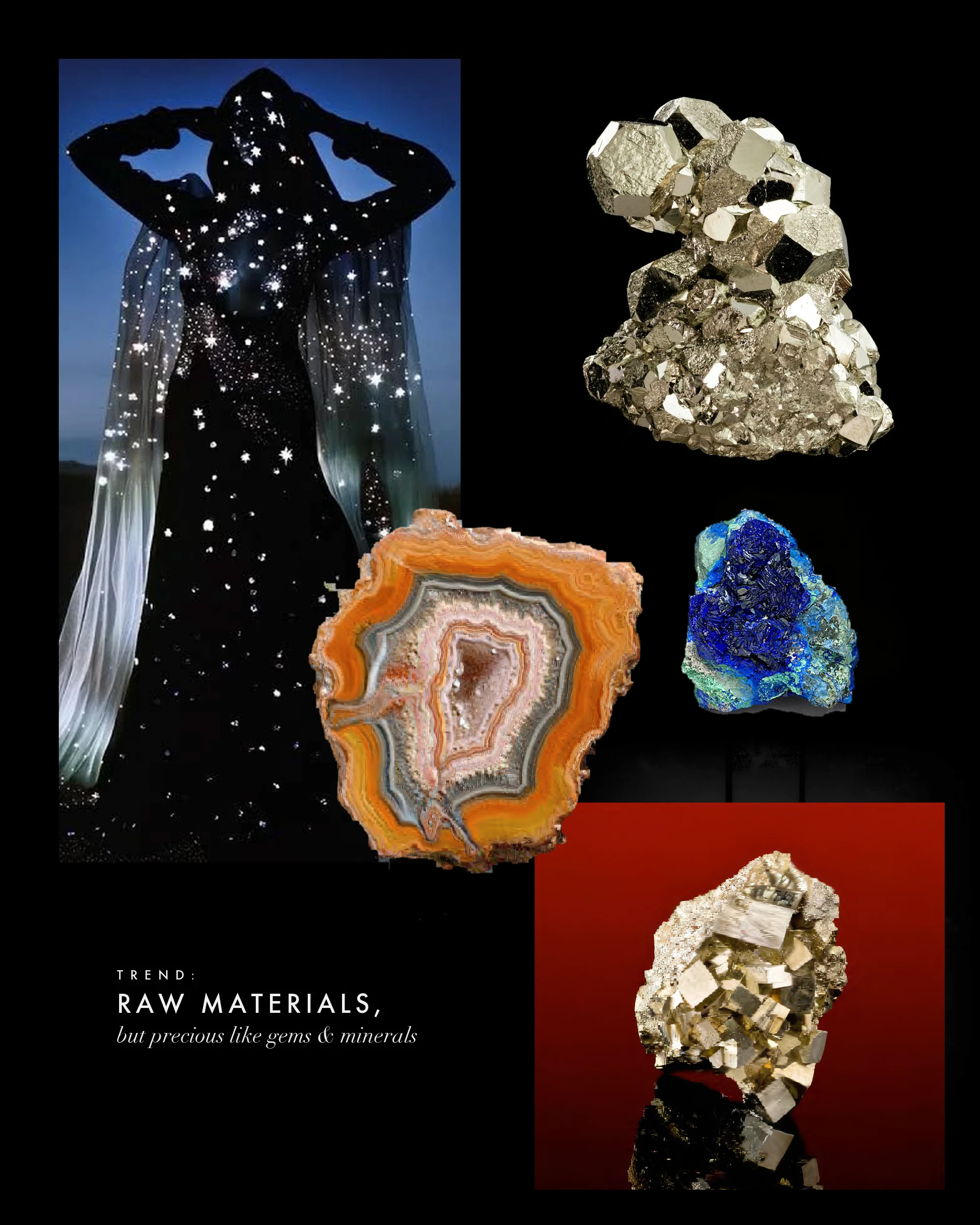
The brief, very open, was part of a broader exercise for the Puig group brands: analyze fashion trends and make a proposal from them. For Prada Parfums, the trend was raw yet precious matter: the geode.
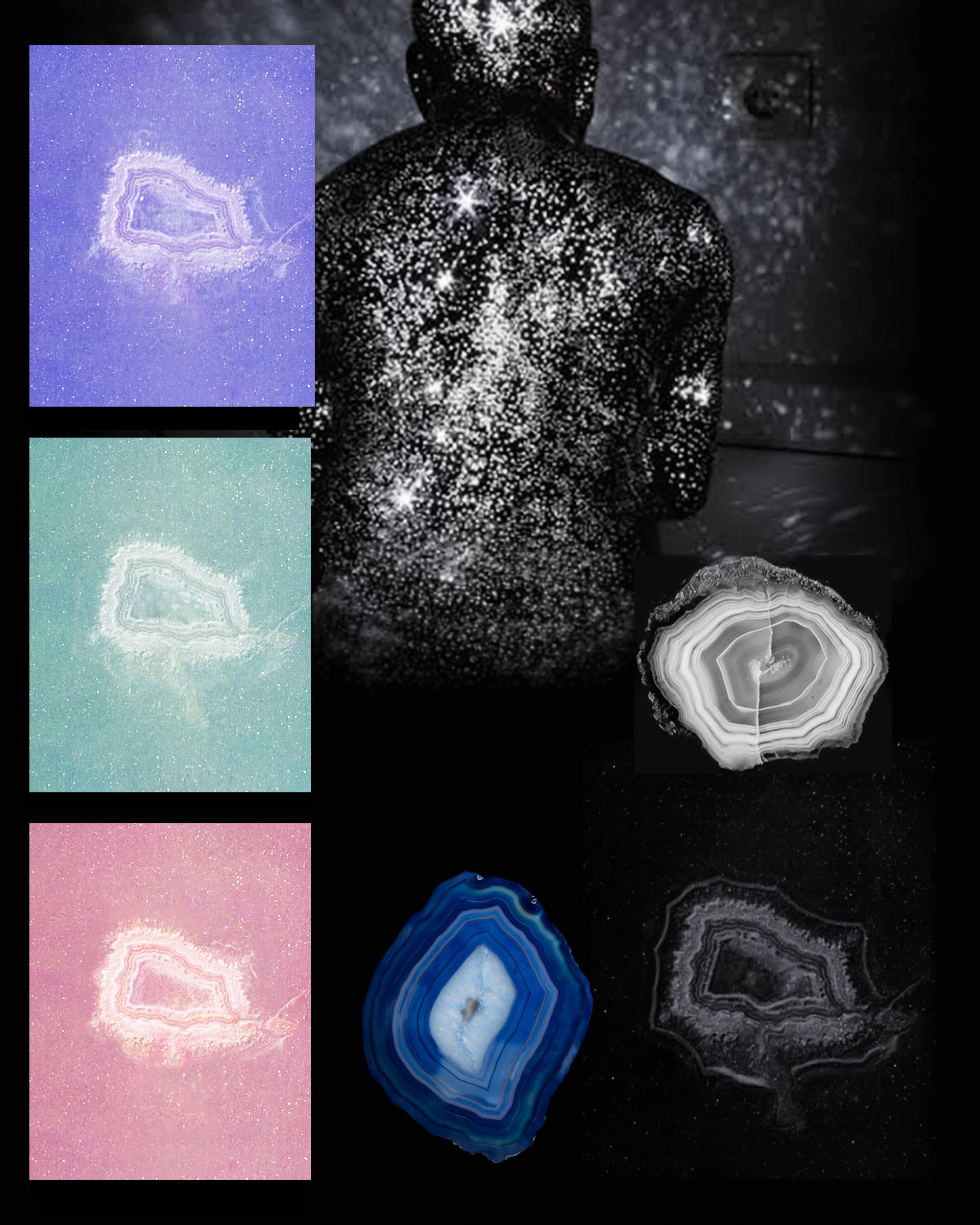
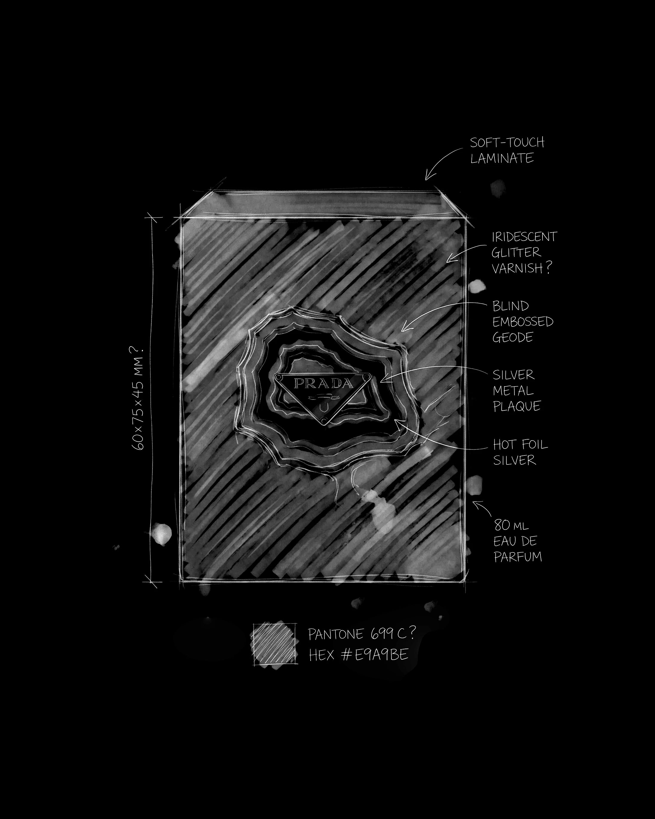
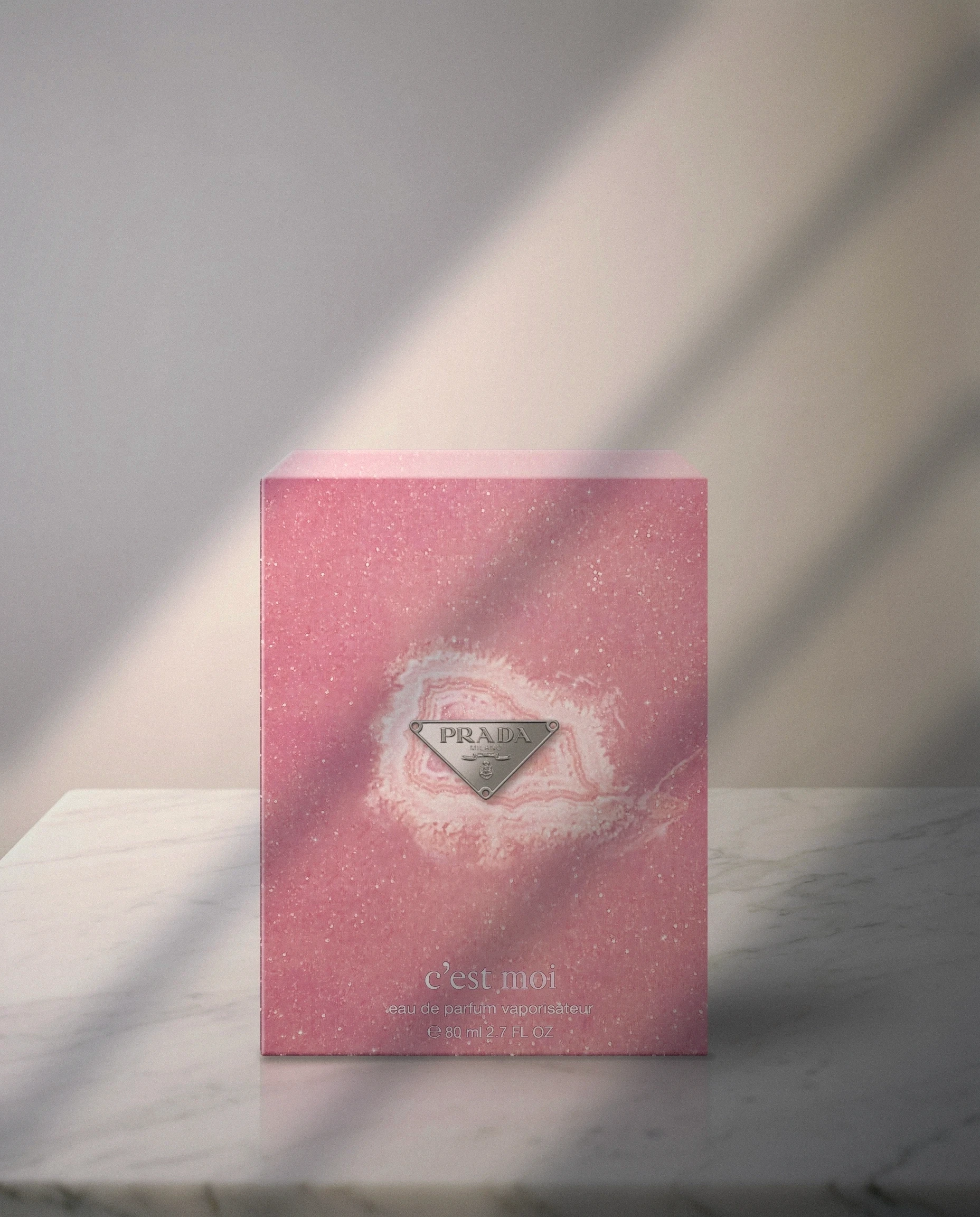
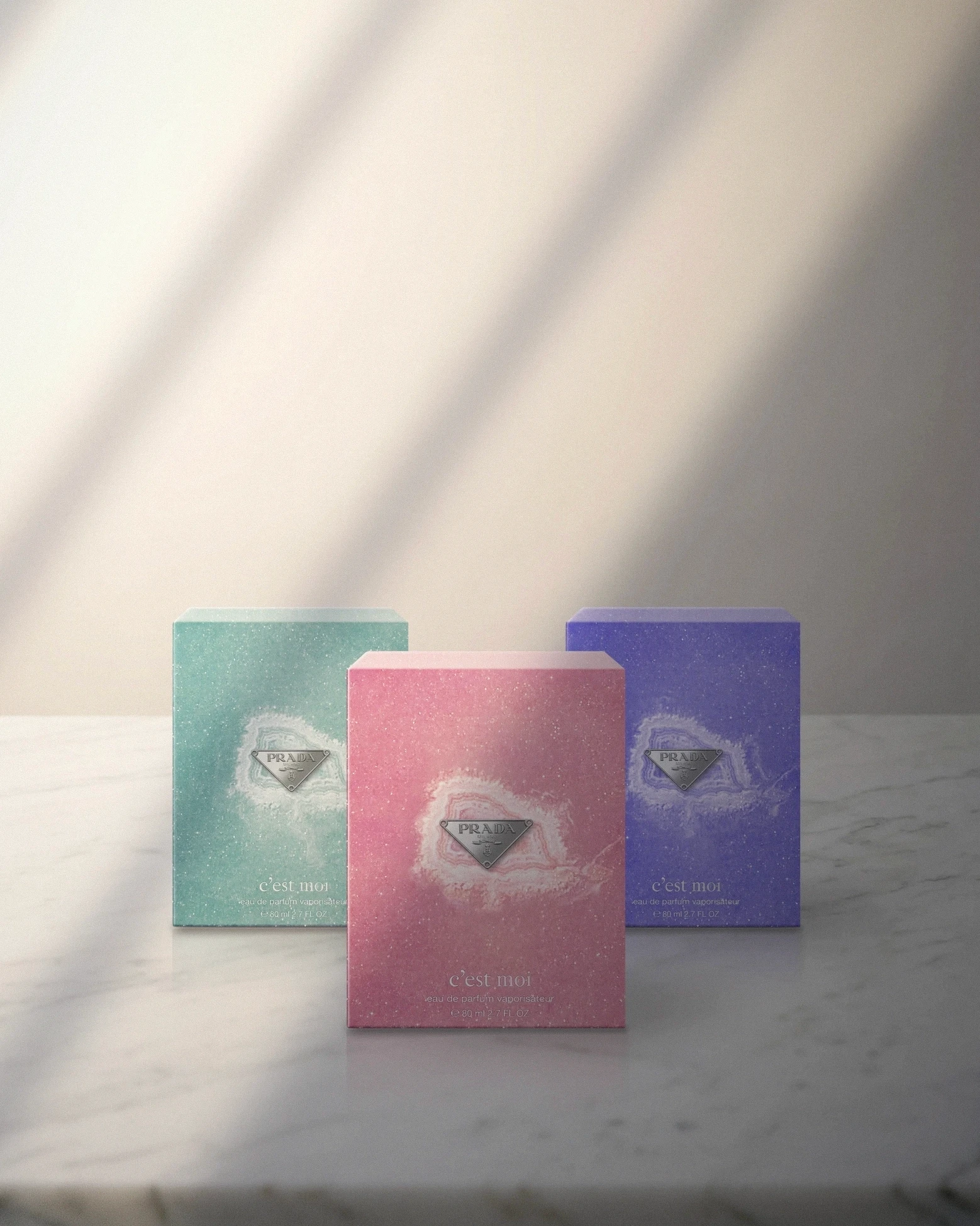
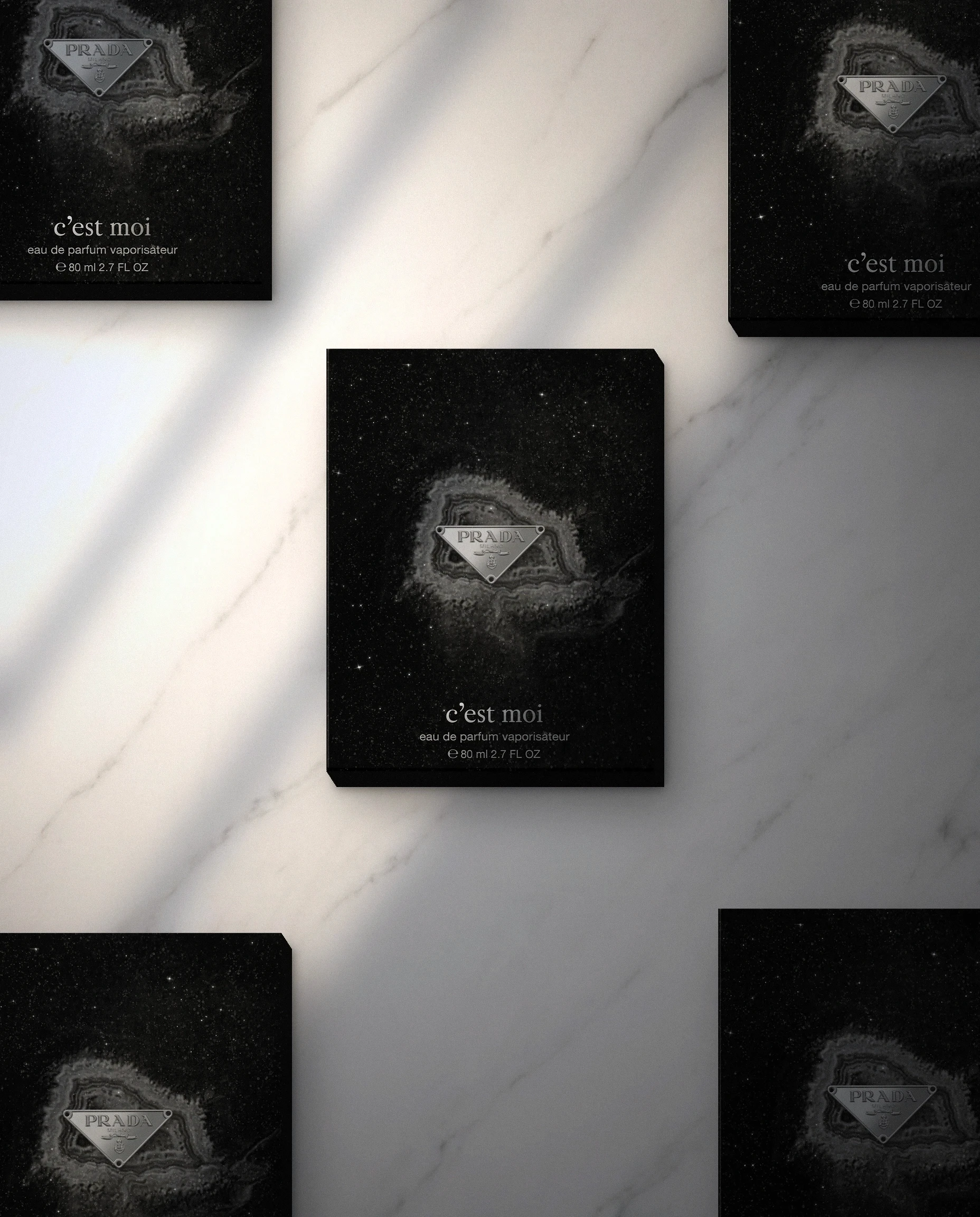
The moodboards run through minerals, agates and pyrites beside a sky of stars. From them comes a box whose surface looks like mineral dust: soft-touch laminate, iridescent glitter varnish and a blind-embossed geode, finished with Prada’s silver metal plaque. Black, aqua green, pink and violet are a color proposal.
An exploratory exercise
It is one of the regular exercises with Puig brands — Prada, Comme des Garçons, Carolina Herrera’s 212 VIP, Gaultier — starting from a very generic concept and pushing creativity to the maximum, working with the creative team of the brand from the very beginning. Some see the light and reach the market.



Prada Parfums Concepts
Packaging proposal for Prada Parfums based on a fashion trend analysis, developed as a concept exercise for the Puig group.
Client
Prada / Puig S.A
Collaborators
Project Management: Carles Pibernat; Design: Irene Sanz
Scope
Creative Direction, Packaging, Art Direction
From trend analysis to the geode
The brief, very open, was part of a broader exercise for the Puig group brands: analyze fashion trends and make a proposal from them. For Prada Parfums, the trend was raw yet precious matter: the geode.
The moodboards run through minerals, agates and pyrites beside a sky of stars. From them comes a box whose surface looks like mineral dust: soft-touch laminate, iridescent glitter varnish and a blind-embossed geode, finished with Prada’s silver metal plaque. Black, aqua green, pink and violet are a color proposal.
An exploratory exercise
It is one of the regular exercises with Puig brands — Prada, Comme des Garçons, Carolina Herrera’s 212 VIP, Gaultier — starting from a very generic concept and pushing creativity to the maximum, working with the creative team of the brand from the very beginning. Some see the light and reach the market.
Prada Parfums Concepts
Packaging proposal for Prada Parfums based on a fashion trend analysis, developed as a concept exercise for the Puig group.
Client
Prada / Puig S.A
Collaborators
Project Management: Carles Pibernat; Design: Irene Sanz
Scope
Creative Direction, Packaging, Art Direction
From trend analysis to the geode
The brief, very open, was part of a broader exercise for the Puig group brands: analyze fashion trends and make a proposal from them. For Prada Parfums, the trend was raw yet precious matter: the geode.
The moodboards run through minerals, agates and pyrites beside a sky of stars. From them comes a box whose surface looks like mineral dust: soft-touch laminate, iridescent glitter varnish and a blind-embossed geode, finished with Prada’s silver metal plaque. Black, aqua green, pink and violet are a color proposal.
An exploratory exercise
It is one of the regular exercises with Puig brands — Prada, Comme des Garçons, Carolina Herrera’s 212 VIP, Gaultier — starting from a very generic concept and pushing creativity to the maximum, working with the creative team of the brand from the very beginning. Some see the light and reach the market.